Coming in 1.4.0
The numbers your watch keeps, beside the doses it never sees
Athlete Mode is a sixth tab charting the fitness readings a watch writes to Apple Health beside the doses logged in Peptrend. Health holds the readings and knows nothing about the doses; Peptrend holds the doses and knows nothing about the readings; the tab is the join.
What it charts
Ten metrics, one chart each: the recovery and fitness readings a watch records as a matter of course. Each is a noisy daily series with a slow signal underneath, which is the same measurement problem the weight chart exists for, so each gets the same treatment. The table lists every metric as the app names it, what the reading is, and whether its chart starts visible.
| Metric | What the reading is | Unit | A day is | Starts |
|---|---|---|---|---|
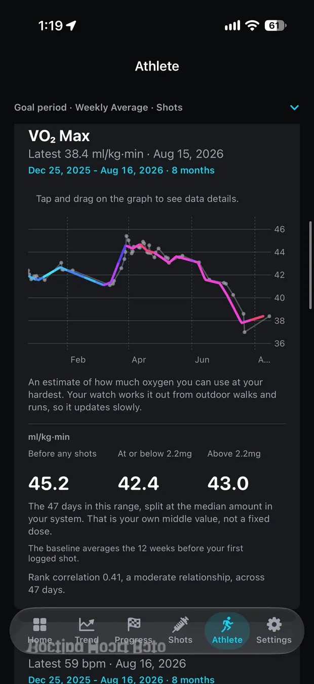
| VO₂ Max | An estimate of how much oxygen you can use at your hardest. A watch works it out from outdoor walks and runs, so it updates slowly. | ml/kg·min | averaged | visible |
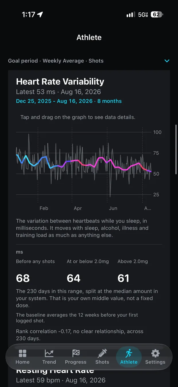
| Heart Rate Variability | The variation between heartbeats during sleep (SDNN), in milliseconds. | ms | averaged | visible |
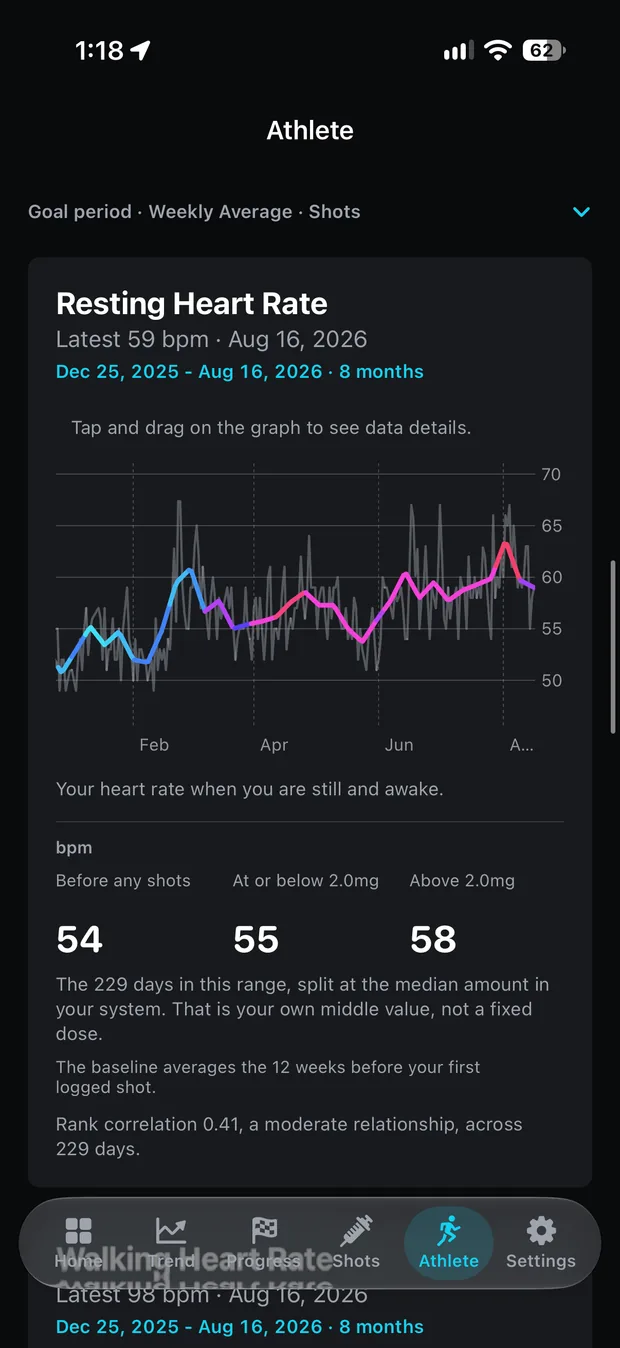
| Resting Heart Rate | Heart rate while still and awake. | bpm | averaged | visible |
| Cardio Recovery | How far heart rate falls in the minute after a hard workout. Recorded only when the watch sees that kind of session. | bpm | averaged | hidden |
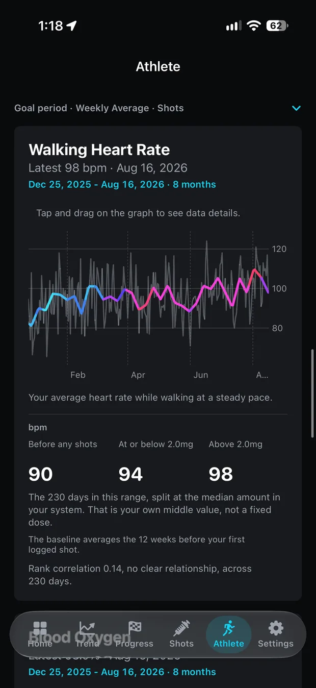
| Walking Heart Rate | Average heart rate while walking at a steady pace. | bpm | averaged | visible |
| Respiratory Rate | Breaths per minute during sleep. | br/min | averaged | hidden |
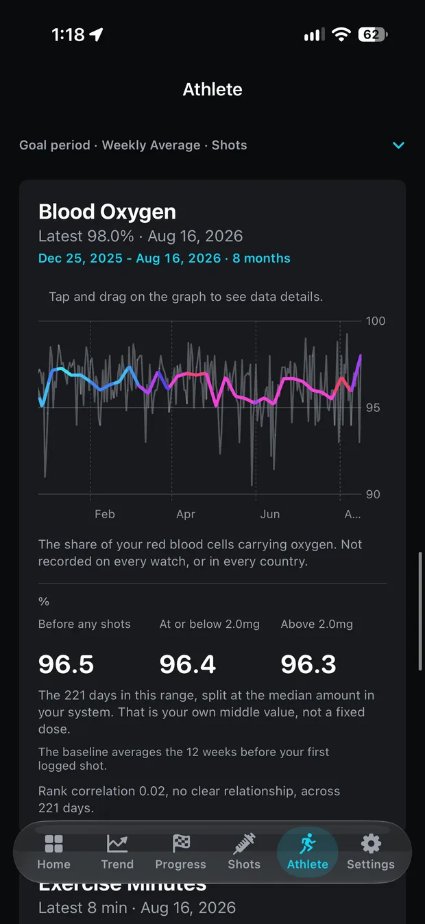
| Blood Oxygen | The share of red blood cells carrying oxygen. Not recorded on every watch, or in every country. | % | averaged | visible |
| Sleeping Wrist Temperature | Overnight wrist temperature, shown as the reading itself rather than the deviation from baseline the Health app draws. | °F or °C by locale | averaged | visible |
| Exercise Minutes | Minutes the watch counted as exercise that day. | min | summed | visible |
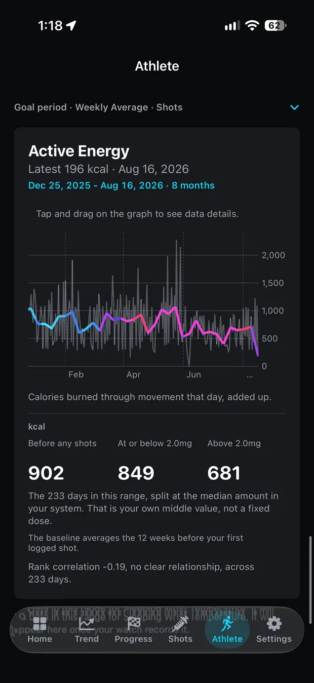
| Active Energy | Calories burned through movement that day. | kcal | summed | visible |
Cardio Recovery and Respiratory Rate start hidden because they are the two most likely to be empty: one is recorded only after a workout hard enough to qualify, the other needs a watch worn overnight. Every metric can be shown, hidden and reordered in Settings. A day with no reading produces no point on the chart rather than a zero, so a metric the watch rarely records draws a sparse line instead of a false collapse. VO₂ max updates every week or two, and zero-filling it would chart one.
Coloured by what you took
Each chart's line takes its colour from your dose history: the dose in effect that day, or the estimated amount still circulating, whichever of the two you pick. The palette is your own shot colour scheme, the same one the weight and dose charts use, so a titration step looks the same wherever it appears. The colouring can sit on the smoothed line, on the raw readings, or on both; smoothed is the default.
The shading is a visual overlay and nothing more. It marks when each reading happened relative to the doses, and it claims nothing about what any dose did to any reading.
The same trend line, ten more places
The smoothed line through each metric is drawn by the same trend methods as the weight chart, picked from a swipeable strip pinned at the top of the tab; the strip and its controls fold into a one-line summary once you scroll into the charts. As of 1.4.0, switching methods morphs the line into its new shape instead of redrawing it, on the Trend tab and on every Athlete chart alike.
Fresh installs start with three methods on the strip: Rolling Median, Robust Adaptive EWMA and Weekly Average. The rest are a tap away in Settings, and the advanced list is Pro. Anyone who already chose a set keeps it, and all fifteen remain available, with the mathematics for each published on the methods page.
One time frame governs the whole tab and defaults to your goal period, so every chart covers the same days. A refresh control re-reads Health on demand, and loading starts at app launch.
Baseline and split averages
Three optional summaries sit with the charts, all off by default. A pre-dose baseline averages each metric over the weeks before your first logged dose, so the time on medication has a reference beside it. Split averages divide the days on screen at your own median circulating amount and show the metric's average on either side of that threshold, recomputed from your own data as the dose history and the time frame change.
The third is a Spearman rank correlation between the metric and the same-day circulating amount. Switched on, it appears only once fourteen or more days carry both a reading and a dose estimate; below fourteen, no number appears at all. Wherever these statistics show, the app prints its own caution beside them, verbatim: “Describes what happened together, not what caused what.” A few dozen days from one person carry no control group, and sleep, alcohol, illness and training load move these numbers as much as anything else does. The pairing is same-day only, so the figure carries no claim about delay or build-up, and the label the app attaches, from “no clear relationship” to “a strong relationship”, grades the size of the correlation, never the reading and never the dose.
What it needs, and what it will not do
A wearable writing to Apple Health, first of all. The tab charts what a watch has recorded, and without one it has nothing to read. Beyond that, the boundaries:
- Opt-in. The mode is offered once, at the end of onboarding, and a toggle in Settings › Athlete Mode turns it on or off at any time. Off, the tab leaves the tab bar entirely.
- Permission asked only when wanted. The ten read types are requested only when the mode is turned on. Leaving it off means Health never shows a permission sheet naming heart rate variability or blood oxygen.
- Read-only. Athlete Mode adds ten read types and writes nothing. Body mass remains the only thing Peptrend has ever written to Health.
- On your devices. The readings stay on the device and in your own private iCloud database. The app has no server and no analytics; the full policy is at /privacy.
- No advice. The app explains what each reading measures and stops there. It does not grade a value as good or bad, takes no position on which way any number should move, and does not predict, recommend or promise.
Part of Peptrend Pro
Athlete Mode arrives with version 1.4.0, which is not on the App Store yet. The version there today, 1.3.3, has no Athlete tab; the tab comes with the update.
It is a Pro feature. On the free tier the tab is present with its charts locked, the same gate every other Pro surface uses, and logging stays free either way: every dose and weigh-in you record is yours at no cost. Pro buys the analysis, and Athlete Mode sits on that side of the line with the smoothed weight trend.
The blog goes further into the trend methods and the measurement problems behind them.