How to chart a titration, and why the scale lags a dose step
Log the doses and the app draws them against your weight: Peptrend's Dose Weeks card colours each segment of the weight line by the dose in force at its end, so this user's 1.2 → 2.0 → 3.0 → 3.5 mg ladder reads as a four-colour ramp. A step does not land at once — the level climbs for several half-lives — and the app charts the ramp you logged rather than proposing one.
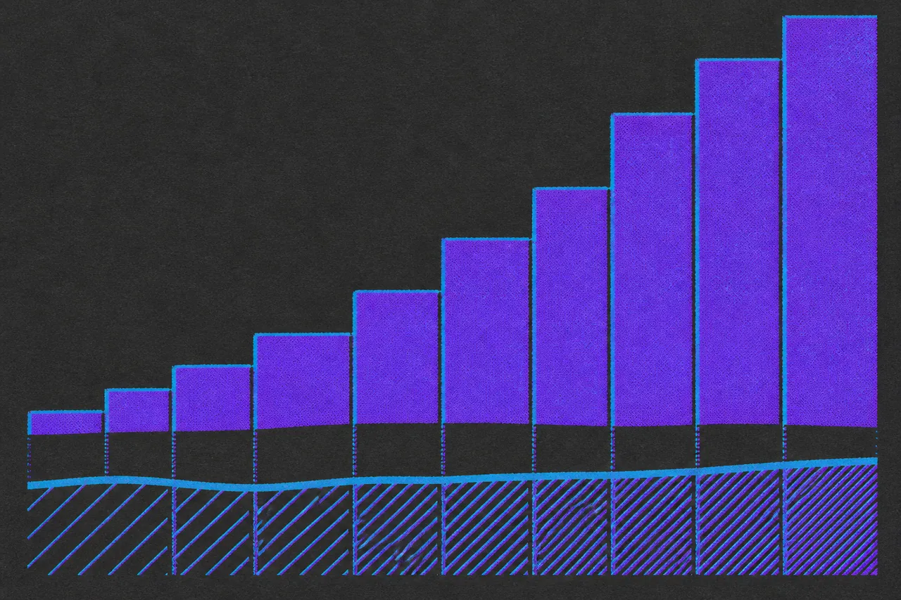
A titration is a dose that changes on purpose, in steps, over weeks. This user’s data runs one: weekly injections climbing 1.2 mg to 2.0 to 3.0 to 3.5. Put that beside a weight log and you have two series over the same calendar, and the question you actually want answered lives in the join between them.
What is a titration, and why does each step hold four weeks?
A titration schedule is a staircase: start low, hold, step up, hold again. The approved GLP-1 labels are written that way. Semaglutide’s label (Ozempic) starts at 0.25 mg once weekly for 4 weeks, moves to 0.5 mg, and asks for at least 4 weeks at each dose before the next increase — and gives the reason in one line, “Follow the dosage escalation below to reduce the risk of gastrointestinal adverse reactions.” Tirzepatide’s (Mounjaro) starts at 2.5 mg once weekly, moves to 5 mg after 4 weeks, then rises in 2.5 mg increments after at least 4 weeks on the current dose.
Two things follow for anyone drawing this. The dose series is a step function with long flat runs, so a chart of it sits horizontal and then jumps. And no two ramps share a shape: step sizes differ, holds differ, and a real log carries skipped weeks and half-steps that no label mentions. The chart has to come from your own record.
Peptrend has no titration planner and no opinion about your ladder. It logs what you took and draws it. It will not recommend a dose, a step size, or a moment to escalate, in the same way its reconstitution calculator refuses to work out a draw volume.
Why can’t you eyeball the weight line around a dose change?
Weight and dose are both time series sampled over the same days, and every interesting question is a joint one: what did the line do in the four weeks after the step to 3.0 mg, and was that different from the four weeks before. Flipping between two charts and holding dates in your head does not answer it.
This user’s log shows why the join has to be automatic. It carries 84 weigh-ins over 225 days, and a logged dose sits behind almost every week of it at four different amounts — so reading the weight line depends on knowing which dose was in force on which day.
Weight is noisy enough to swamp a careless comparison anyway. On that same file consecutive weigh-ins differ by 1.16 lb on average against an underlying drift of 0.098 lb/day, so the noise runs 11.9 times the signal — the argument in what an overnight gain is actually made of. Eyeballing a fortnight either side of a dose step is reading noise.
How do you get doses and weight onto one chart?
On the Doses tab, the card headed Dose Weeks — Shot Weeks if your medication is an injection rather than a tablet — is subtitled “Weight colored by dose week”. It connects your weigh-ins end to end and colours each connecting segment by the last dose taken on or before the later of its two points. A run of weigh-ins under 2.0 mg is one colour; the segment that crosses your step to 3.0 mg is the first to change.
The line here is your raw scale reading. Smoothing lives on the Trend tab, along with the fifteen trend methods, and that chart is Pro; the Dose Weeks card carries no gate at all.
Three more details do the work of a legend:
- Every dose in view also draws a dashed vertical rule in its own colour, as long as no more than 30 are in view. Past that — roughly a month of daily dosing — the rules would read as hatching over the line they annotate, so the app drops all of them.
- The stretch before your first logged dose is drawn in a neutral slate,
#5A606B, so a pre-medication baseline never borrows a dose colour it did not earn. - Tapping or dragging the chart reads out the weight, which dose number was in force, that dose in milligrams, and the date it went in. Before the first dose it says “Before logged doses”.
What decides the colour of each dose?
The rule is one line of arithmetic. Your smallest logged dose sits at fraction 0 of the gradient, your largest at fraction 1, and everything else lands in between:
fraction = (dose − lowest dose) / (highest dose − lowest dose)For this user’s log’s ladder, that puts 1.2 mg at 0.000, 2.0 mg at 0.348, 3.0 mg at 0.783 and 3.5 mg at 1.000. The colour gaps are uneven because the milligram steps are uneven: 2.0 to 3.0 travels twice as far along the ramp as 3.0 to 3.5. A history with a single dose in it is pinned to 0.5 so its colour stays put.
Because the ends of the ramp are your own minimum and maximum, colour answers “where in my range” and never “how many milligrams”. Log a new highest dose and every earlier dose slides toward the light end. Type 35 mg where you meant 3.5 and the whole picture rescales around the typo, which is one more reason every field you log has a fixed shape.
The legend is what supplies the milligrams, and it is deliberately short: it collapses to one chip per distinct dose level rather than one per dose. A weekly medication over three months would otherwise print a dozen chips reading four numbers, and a daily one would print ninety. Four dose levels, four chips — a titration legend.
Do heavier doses look heavier? Five of the seven ramps keep the ordering
Peptrend ships seven dose gradients. Two are sweeps around the colour wheel at fixed saturation and brightness; five are hand-picked lists of stops. That difference decides whether a heavier dose reliably looks heavier.
Below is the WCAG relative luminance of each ramp’s own stops, and of five evenly spaced samples along each hue sweep. Luminance runs 0 (black) to 1 (white).
| Ramp | Shape | Lightest dose | Heaviest dose | Luminance runs one way? |
|---|---|---|---|---|
| Signature (default) | hue sweep 0.52 → 0.96 | 0.61 | 0.24 | No — falls to 0.16, then rises |
| Rainbow | hue sweep 0.00 → 0.85 | 0.23 | 0.28 | No — peaks at 0.80 a quarter in |
| Greyscale | 4 stops | 0.09 | 1.00 | Yes, rising |
| Purple → Green | 4 stops | 0.24 | 0.63 | Yes, rising |
| Sunset | 5 stops | 0.06 | 0.75 | Yes, rising |
| Heat | 4 stops | 0.76 | 0.17 | Yes, falling |
| Ocean | 4 stops | 0.11 | 0.72 | Yes, rising |
Stoelzle and Stein, writing in Hydrology and Earth System Sciences in 2021, put the case against rainbow maps in terms that apply directly here: the same data range is not equally represented across a rainbow map, and abrupt changes of lightness and saturation lead to an unintended focus on some sections of the range. They point readers at perceptually uniform maps such as viridis, where lightness climbs monotonically. Greyscale, Purple → Green, Sunset and Ocean climb that way; Heat runs the other way.
None of which makes Signature wrong. It is the default because it stays readable on a near-black chart, its cyan-to-pink sweep separates four adjacent doses cleanly, and the legend carries the milligrams anyway. If you want heavier doses to look heavier without consulting a key, use Greyscale or Heat. Two other colour modes sit alongside the presets: Manual, where each dose keeps the colour you gave it while logging, and Custom, a straight blend between two endpoints you pick.
Where else do dose colours show up, and what is free?
The same palette is computed in one place so the charts can never disagree, which means one preset choice recolours everything that reads a dose.
| Where | What it shows | Tier |
|---|---|---|
| Dose Weeks card, Doses tab | Weight line, each segment coloured by the dose behind it | Free |
| Dose history list | Every dose, every amount, every site | Free |
| Per-dose colour picked while logging | The colour you chose, kept as part of the record | Free |
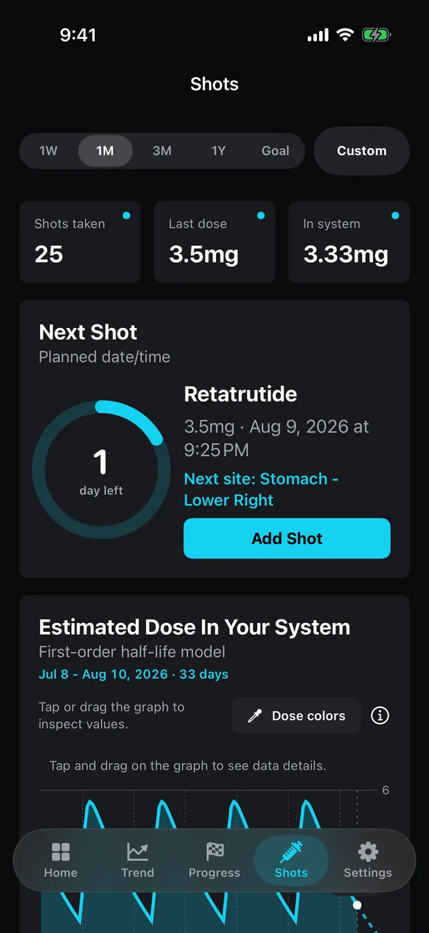
| “Dose colors” on the in-system chart | Splits the decay curve into segments coloured by the dose in force | Pro |
| Dose Over Time card | The dose ladder itself, plotted at the amount you took | Pro |
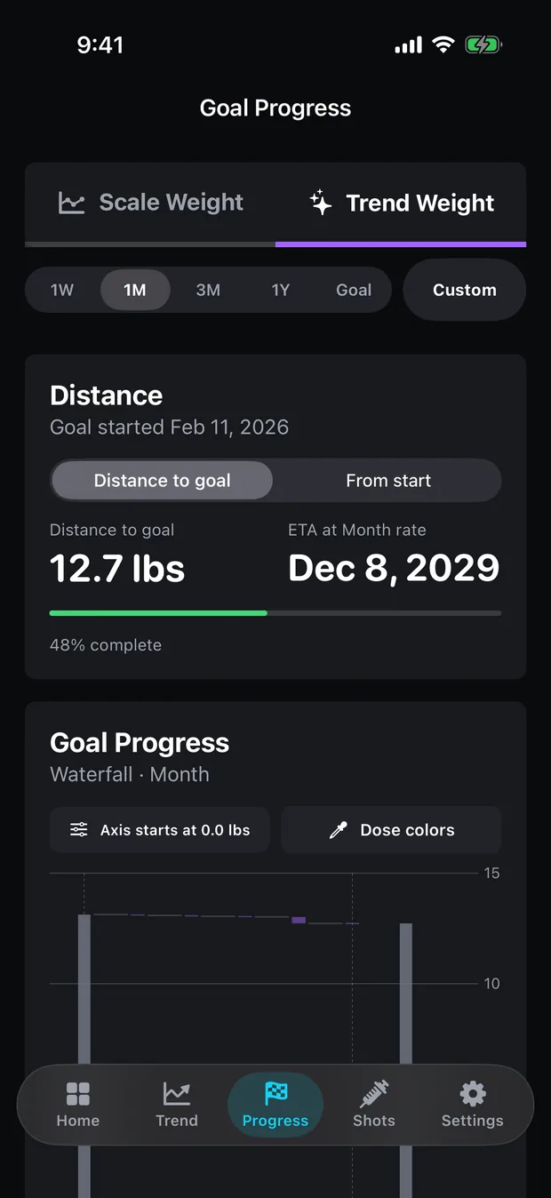
| Goal waterfall “Dose colors” | Weekly weight bars tinted by that week’s dose | Pro |
| Custom Color Ramps | Your own gradient instead of the built-in sweep | Pro |
The in-app pitch for the Pro dose colours is honest about what they buy: “Shade every dose by size, so the titration ramp shows up in the chart.” The log itself is not part of that trade — every entry and every amount stays free, and what stays free draws the line. The waterfall is the Pro one worth knowing about: it tints each weekly bar by the last dose taken inside that bucket, so the ramp reads against weekly weight change rather than daily scatter. Setting a goal you can hit covers the rest of that tab.
Can the chart tell you whether a dose increase did anything?
A colour ramp shows correlation in time and nothing more. Dose steps do not act instantly — a weekly compound accumulates for several half-lives before its level settles, so the milligrams in force during a week and the milligrams the model counts as in your system are two different numbers, and how long a GLP-1 takes to reach steady state explains the gap. Diet, training, illness and water moved the same line over the same weeks, and Peptrend never sees any of them.
Read the ramp as a record of what you did, laid over a record of what your weight did. The app will not tell you whether or when to change a dose. Several compounds in its medication list, including the one in this user’s data, sit behind an in-app disclosure headed “Not FDA approved, research use only.” Decisions about a titration belong with you and a licensed clinician. The support page answers questions about what the app is doing.
Common questions
Can Peptrend plan a titration schedule for me?
No. There is no titration planner in the app. It charts the doses you have already logged and will not recommend a dose, a step size, or when to escalate.
What does the colour of a dose actually mean?
Where that dose sits between the smallest and largest you have ever logged. Your lowest dose sits at one end of the gradient and your highest at the other, so the colour is relative to your own history rather than tied to a fixed milligram value.
Do I need Pro to see my doses against my weight?
No. The Dose Weeks card on the Doses tab — the weight line with each segment coloured by the dose behind it, plus its legend — carries no gate. The Dose Over Time chart and the dose-coloured goal waterfall are Pro.
How long after a dose increase would the chart show anything?
Longer than a fortnight. The level of a weekly compound climbs for several half-lives after a step before it settles, and on this user's log the day-to-day scale noise runs 11.9 times the underlying drift — so a couple of weeks either side of a step is reading noise. The chart shows what your weight did; it cannot attribute that to the dose.